Tuesday, August 31, 2010

one rockin' chair

My mother said that a rocking chair or glider was a "necessity," so we did a poll of recent new city moms, to confirm it is worth allocating the space to a chair. It seems that the overwhelming consensus is that a glider is invaluable - especially if you plan to breastfeed. The problem is that they are large and really ugly and expensive ($400-800 range)


There have been some improvements in glider design since the 80s and 90s. A friend had gotten the following glider from Monte Design which actually pretty nice design-wise for a glider, but it is quite pricey ($1,000+) and is still pretty large for our diminutive space.

So we searched on line for rocking chairs on craigslist and nothing really caught our eye. Then we found the one on ebay. 


We decided to keep an eye on the auction over the weekend. Saturday we went and looked at a Horseman Antiques on Atlantic avenue. This store is literally chock-full of furniture - chairs stacked on top of tables on top of credenzas (I did get stuck a couple times as my perception of my size and actual size differ). The store has some really beautiful pieces and it was a fun way to spend an afternoon. Then we found it! The rocker we had seen on ebay, in much worse shape. But the good thing is we got to sit in the chair - and it was heaven. Amazingly enough, this tiny rocker fits both of us comfortabley (me at 5'6 and Dave at 6'3), and had the perfect porportions. When we got home we  found the chair we had just sat on listed on ebay for a much higher price than the black framed one we found first.


Our friends M+B recommended a 'sniper' program to bid for us on ebay. That way the bid would not go in until the last seconds, and you don't have to worry about re-bidding. M+B had stopped by to review electrical plans which helped keep our minds and our nerves at bay through the final minutes of the auction. Thankfully, with bated breath, we won the auction and now our chair is on its way from Spokane via Grayound express!


eye of the beholder

Beauty is in the eye of the beholder, and I've always learned that you should only by art that you like. We spent time perusing etsy for fun prints that weren't too baby-ish. We liked these from Sugar Fresh, but the colors weren't quite right.


Then there were these from Sycamore Street Press which were cheeky, but perhaps a bit too bold, and again the colors weren't perfect (love the french bulldog though).


So then I went to one of my standby art sites - 20x200 which has great limited edition affordable art. We found these prints from Jane Mount's Ideal Book Series which are perfect. They have great color and great titles!


And here they are hung above the crib!


irony in ivory

As an expectant mother, I didn't consider a changing table as a necessity. It seemed like 'another piece of furniture' that you didn't need. After reading this post from a child grows in brooklyn, and reading more from the 'baby bargains' book, a changing height surface is a back saver - especially when you are going through ten plus diapers a day.


So I put my friend A* on the hunt (I was exhausted after all that crib research). I gave her dimensions of the space available as well as the dimensions of a standard changing pad. We wanted a simple clean-lined piece for $100 or less that would relate to our crib and our other furniture. Turns out A* is a first-class craigslist scavenger as she found this dresser for $75.


As we were unloading it off of the seller's truck we were pleasantly surprised with the quality of the piece - all drawers were dovetailed and solid wood - the drawers only fit in their assigned opening and the beading detail was quite pretty. The finish had seen better days, but it had beautiful lines. Then we opened the drawer and found the Baker Furniture insignia. The irony was lost on no one.


So Dave painted the piece up - the antique brass hardware is a stunning contrast. We think it turned out quite well and the storage it provides will be invaluable.


crib inspiration

Choosing the crib was a bit of a dilemma, especially as the crib will located in the open area with our other furniture. At first I thought we wanted a more modern crib. I loved the Oeuf Sparrow crib in grey, but at $699 (not including the mattress) it seemed a bit excessive. Even on our favorite website (craigslist), we couldn't find it for less that $400 used.
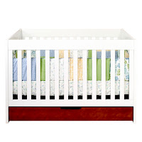
Our friends recommended this BabyMod ParkLane crib from Wal-mart (I know...I was surprised as well). It is a very sturdy crib and has the added bonus of under-bed storage and at $281 (again without the mattress) it seemed like a much better deal, plus we had the recommendation of durability/quality/stability from other parents.
Then we decided that maybe we should just go with the Ikea Gulliver crib in white. Simple and at $99, not too shabby. So we went to go look at it at the store and there weren't any to test drive and check for quality. 


So we were at a loss. Then I saw this image on Design*Sponge:


I really loved that this new mother counterposed something more modern with something more traditional. The simplicity of the white bedding and sheets with the bright orange bumper was beautiful. We had found a beautiful cotton percale fabric at fibernotion in our neighborhood (on sale) AND we found a white Jenny Lind crib on craigslist for a mere $65. We rented a zipcar for the morning and did a quick load/unload on the UES with the seller. The crib needed a little touch up paint here and there (nothing we couldn't handle) and we are very happy with our selection. 


Monday, August 30, 2010

bump


So we've reached the third trimester and it's kind of obvious now...

craigslist is your friend


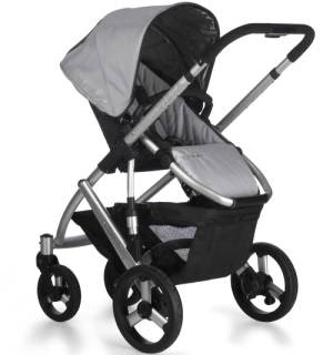
When you live in a city, you only have finite space. This has it's ups and downs. The upside is that people have to get rid of stuff to make room for new stuff. This is how we got our first baby equipment - the stroller. We got a 2009 Uppababy stroller (aptly named, don't you think?), as some Brooklyn parents were 'upgrading' to the 2010 model. Strollers in the city are like cars. As soon as you 'drive' them off the lot they immediately loose half their value. Hence our barely used half-price Vista stroller in silver. It folds, it flips, it accommodates a car seat, an additional jump seat, AND three bags of groceries! It doesn't look half bad either...

the plan


So making room in a one bedroom apartment for a baby is a challenge. We knew we did not want the baby in our bedroom, so we decided to make a 'baby zone' in our living space. The challenge was keeping the areas discrete as we hope to still entertain at some point after our bundle of joy arrives. Selection of each of the pieces of furniture had to be careful as not to overpower the room and not feel too 'baby-ish' but still be welcoming and stimulating for Ella-Hudson. We will detail our finds in the coming posts.

time for a close up

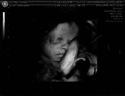
So we had gone 29 weeks without having to do the '4D' or '3D'  ultrasound. Dave was really apprehensive about seeing it as the ones in the room all look like aliens, we don't want to think about our little one as an alien. The technician at our last visit flipped the switch and we got to see our baby. Dave says that Ella-Hudson has my pointy elbows. I guess it's a defensive mechanism!

learning to let go


We've had a year full of ups and downs. A stolen iPhone. A relaxing Caribbean vacation. A lost job. A dream job offer - in another state. A Baby! A roommate. Losing our beloved dog, Giselle suddenly. A job offer on hold. A family reunion. A job offer still on hold. Design inspiration. Getting bigger. Redefining 'dream job.' Our place to ourselves. Letting go. Life is rich.